使用matplotlib绘制超可爱超萌化的图表
数据可视化是讲故事的好方法,从中可以轻松地吸收信息并识别数据中的模式。
在 Netflix 上看完精彩的节目或电影后,您有没有想过 Netflix 为您提供了如此多的惊人内容?当然,我并不孤单,不是吗?一个想法会导致另一个想法,在不知不觉中,您已经下定决心进行探索性数据分析,以了解更多关于最受欢迎的演员是谁以及哪个国家/地区更喜欢哪种类型的信息。
使用 Python 制作常规的条形图和饼图,虽然它们在传达结果方面做得很好,但我想为这个项目添加一些有趣的元素。
我最近了解到你可以在 Python 最流行的数据可视化库 Matplotlib 中创建类似 xkcd 的绘图,并决定我应该在这个项目中整理我所有的 Matplotlib 可视化,只是为了让事情变得更有趣。
一起来看看数据怎么说吧!
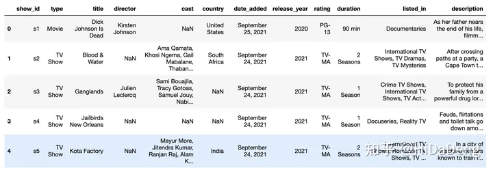
导入数据
7787部电影/TV节目的信息
import pandas as pd

df = pd.read_csv("netflix_titles.csv")
df.head()
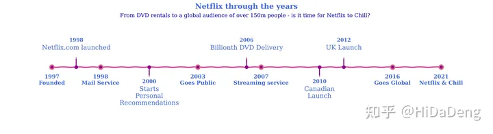
Netflix历年发展里程碑
描述一下 Netflix 多年来演变的时间表。
import matplotlib.pyplot as plt
import numpy as np
plt.rcParams['figure.dpi'] = 200


# these go on the numbers below
tl_dates = [
    "1997\nFounded",
    "1998\nMail Service",
    "2003\nGoes Public",
    "2007\nStreaming service",
    "2016\nGoes Global",
    "2021\nNetflix & Chill"
]
tl_x = [1, 2, 4, 5.3, 8, 9]

# the numbers go on these
tl_sub_x = [1.5,3,5,6.5,7]

tl_sub_times = [
    "1998","2000","2006","2010","2012"
]

tl_text = [
    "Netflix.com launched",
    "Starts\nPersonal\nRecommendations","Billionth DVD Delivery","Canadian\nLaunch","UK Launch"]

with plt.xkcd():
# Set figure & Axes
    fig, ax = plt.subplots(figsize=(15, 4), constrained_layout=True)
    ax.set_ylim(-2, 1.75)
    ax.set_xlim(0, 10)

    # Timeline : line
    ax.axhline(0, xmin=0.1, xmax=0.9, c='deeppink', zorder=1)

    # Timeline : Date Points
    ax.scatter(tl_x, np.zeros(len(tl_x)), s=120, c='palevioletred', zorder=2)
    ax.scatter(tl_x, np.zeros(len(tl_x)), s=30, c='darkmagenta', zorder=3)
    # Timeline : Time Points
    ax.scatter(tl_sub_x, np.zeros(len(tl_sub_x)), s=50, c='darkmagenta',zorder=4)

    # Date Text
    for x, date in zip(tl_x, tl_dates):
        ax.text(x, -0.55, date, ha='center',
                fontfamily='serif', fontweight='bold',
                color='royalblue',fontsize=12)

    # Stemplot : vertical line
    levels = np.zeros(len(tl_sub_x))
    levels[::2] = 0.3
    levels[1::2] = -0.3
    markerline, stemline, baseline = ax.stem(tl_sub_x, levels, use_line_collection=True)
    plt.setp(baseline, zorder=0)
    plt.setp(markerline, marker=',', color='darkmagenta')
    plt.setp(stemline, color='darkmagenta')

    # Text
    for idx, x, time, txt in zip(range(1, len(tl_sub_x)+1), tl_sub_x, tl_sub_times, tl_text):
        ax.text(x, 1.3*(idx%2)-0.5, time, ha='center',
                fontfamily='serif', fontweight='bold',
                color='royalblue', fontsize=11)

        ax.text(x, 1.3*(idx%2)-0.6, txt, va='top', ha='center',
            fontfamily='serif',color='royalblue')

    # Spine
    for spine in ["left", "top", "right", "bottom"]:
        ax.spines[spine].set_visible(False)

    # Ticks
    ax.set_xticks([])
    ax.set_yticks([])

    # Title
    ax.set_title("Netflix through the years", fontweight="bold", fontfamily='serif', fontsize=16, color='royalblue')
    ax.text(2.4,1.57,"From DVD rentals to a global audience of over 150m people - is it time for Netflix to Chill?", fontfamily='serif', fontsize=12, color='mediumblue')

    plt.show()
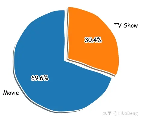
电影 vs 电视综艺
接下来,我决定看一下电影与电视节目的比例。
col = "type"
grouped = df[col].value_counts().reset_index()
grouped = grouped.rename(columns = {col : "count", "index" : col})

with plt.xkcd():
    explode = (0, 0.1)  # only "explode" the 2nd slice (i.e. 'TV Show')
    fig1, ax1 = plt.subplots(figsize=(5, 5), dpi=100)
    ax1.pie(grouped["count"], explode=explode, labels=grouped["type"], autopct='%1.1f%%',
        shadow=True, startangle=90)
    ax1.axis('equal')  # Equal aspect ratio ensures that pie is drawn as a circle.

    plt.show()
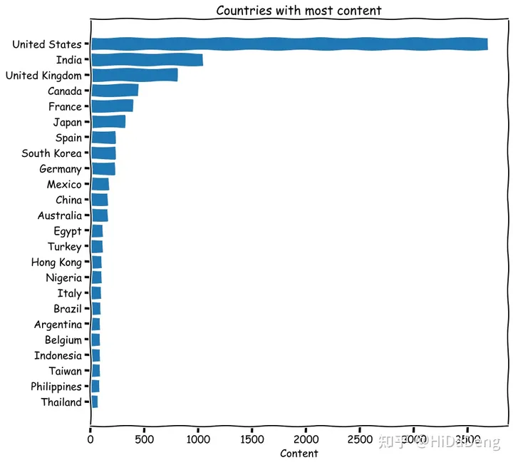
内容最多的国家
from collections import Counter
col = "country"

categories = ", ".join(df[col].fillna("")).split(", ")
counter_list = Counter(categories).most_common(25)
counter_list = [_ for _ in counter_list if _[0] != ""]
labels = [_[0] for _ in counter_list]
values = [_[1] for _ in counter_list]

with plt.xkcd():
    fig, ax = plt.subplots(figsize=(10, 10), dpi=100)
    y_pos = np.arange(len(labels))
    ax.barh(y_pos, values, align='center')
    ax.set_yticks(y_pos)
    ax.set_yticklabels(labels)
    ax.invert_yaxis()  # labels read top-to-bottom
    ax.set_xlabel('Content')
    ax.set_title('Countries with most content')

    plt.show()
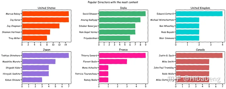
最流行的导演
from collections import Counter
from matplotlib.pyplot import figure
import math

colours = ["orangered", "mediumseagreen", "darkturquoise", "mediumpurple", "deeppink", "indianred"]
countries_list = ["United States", "India", "United Kingdom", "Japan", "France", "Canada"]
col = "director"

with plt.xkcd():
    figure(num=None, figsize=(20, 8))
    x=1
    for country in countries_list:
        country_df = df[df["country"]==country]
        categories = ", ".join(country_df[col].fillna("")).split(", ")
        counter_list = Counter(categories).most_common(6)
        counter_list = [_ for _ in counter_list if _[0] != ""]
        labels = [_[0] for _ in counter_list][::-1]
        values = [_[1] for _ in counter_list][::-1]
        if max(values)<10:
            values_int = range(0, math.ceil(max(values))+1)
        else:
            values_int = range(0, math.ceil(max(values))+1, 2)
        plt.subplot(2, 3, x)
        plt.barh(labels,values, color = colours[x-1])
        plt.xticks(values_int)
        plt.title(country)
        x+=1
    plt.suptitle('Popular Directors with the most content')
    plt.tight_layout()
    plt.show()
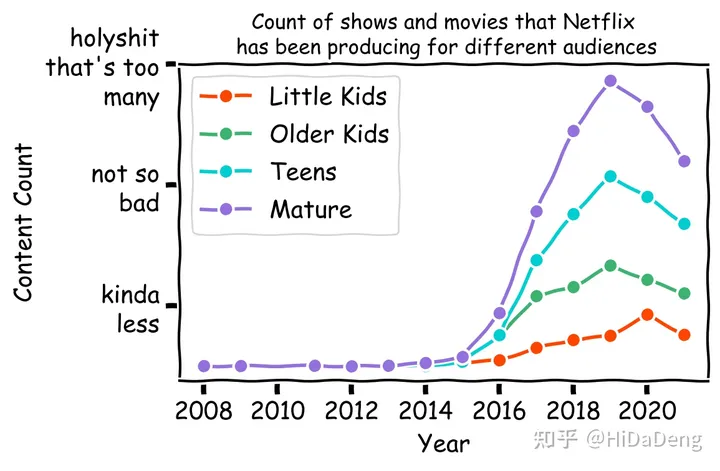
Netflix 专注于什么样的内容?
我还想浏览评级栏并比较 Netflix 为儿童、青少年和成人制作的内容量——以及这些年来他们的重点是否从一个群体转移到另一个群体。
为此,我首先查看了 DataFrame 中的独特评级:
df["date_added"] = pd.to_datetime(df['date_added'])df['year_added'] = df['date_added'].dt.year.astype('Int64')ratings_list = ['TV-MA', 'R', 'PG-13', 'TV-14', 'TV-PG', 'TV-G', 'TV-Y', 'TV-Y7', 'PG', 'G', 'NC-17', 'TV-Y7-FV']ratings_group_list = ['Little Kids', 'Older Kids', 'Teens', 'Mature']ratings_dict={ 'TV-G': 'Little Kids', 'TV-Y': 'Little Kids', 'G': 'Little Kids', 'TV-PG': 'Older Kids', 'TV-Y7': 'Older Kids', 'PG': 'Older Kids', 'TV-Y7-FV': 'Older Kids', 'PG-13': 'Teens', 'TV-14': 'Teens', 'TV-MA': 'Mature', 'R': 'Mature', 'NC-17': 'Mature'}for rating_val, rating_group in ratings_dict.items(): df.loc[df.rating == rating_val, "rating"] = rating_group df['rating_val']=1x=0labels=['kinda\nless', 'not so\nbad', 'holyshit\nthat\'s too\nmany']with plt.xkcd(): for r in ratings_group_list: grouped = df[df['rating']==r] year_df = grouped.groupby(['year_added']).sum() year_df.reset_index(level=0, inplace=True) plt.plot(year_df['year_added'], year_df['rating_val'], color=colours[x], marker='o') values_int = range(2008, math.ceil(max(year_df['year_added']))+1, 2) plt.yticks([200, 600, 1000], labels) plt.xticks(values_int) plt.title('Count of shows and movies that Netflix\n has been producing for different audiences', fontsize=12) plt.xlabel('Year', fontsize=14) plt.ylabel('Content Count', fontsize=14) x+=1 plt.legend(ratings_group_list) plt.tight_layout() plt.show()
如果您发现该资源为电子书等存在侵权的资源或对该资源描述不正确等,可点击“私信”按钮向作者进行反馈;如作者无回复可进行平台仲裁,我们会在第一时间进行处理!
评价 0 条
- 最近热门资源
- 银河麒麟桌面操作系统备份用户数据 125
- 统信桌面专业版【全盘安装UOS系统】介绍 120
- 银河麒麟桌面操作系统安装佳能打印机驱动方法 111
- 银河麒麟桌面操作系统 V10-SP1用户密码修改 105
- 最近下载排行榜
- 银河麒麟桌面操作系统备份用户数据 0
- 统信桌面专业版【全盘安装UOS系统】介绍 0
- 银河麒麟桌面操作系统安装佳能打印机驱动方法 0
- 银河麒麟桌面操作系统 V10-SP1用户密码修改 0

prtyaa 收益393.62元

zlj141319 收益218元

1843880570 收益214.2元

IT-feng 收益209.03元

风晓 收益208.24元

777 收益172.71元

Fhawking 收益106.6元

信创来了 收益105.84元

克里斯蒂亚诺诺 收益91.08元

技术-小陈 收益79.5元